ClearView Flex Mobile: Annotation, Wherever You Join

.png)
If you’re already joining Flex sessions from iPad or iPhone, this update is for you.
Flex Mobile is built around a simple goal: make it easier to stay in the flow of review and keep feedback moving, even when you’re not at your desk. That’s why annotation is now available on both iPad and iPhone, so you can mark up frames, sketch notes, and add comments directly in-session from mobile.
In this post, we unpack how the mobile experiences differ by device, and the product thinking behind designing them that way.
Designing for Intention (and how people actually review)
At Sohonet, we spend a lot of time looking at how creative teams really work, how feedback happens, how decisions get made, and what “being in the room” looks like when the room is distributed.
When people join from an iPad versus an iPhone, they often show up with different intentions. That’s why Flex Mobile doesn’t force a single experience across both devices.
“It was important for us to treat iPad and iPhone as two distinct experiences,” says Flora Muschamp, Head of UI/UX. “People use them in very different ways, and Flex needed to reflect that.”
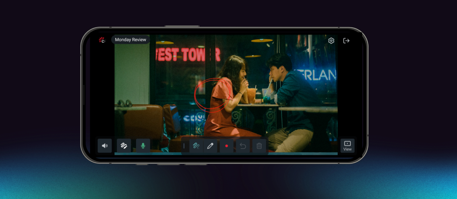
Joining from iPhone often happens in imperfect conditions - travelling, between meetings, or juggling other work.
In those moments, the goal isn’t to replicate desktop. It’s to stay connected and contribute quickly.
The iPhone experience prioritises:
- Quick, low-friction annotation for fast notes and markups
- Low-bandwidth, resilient participation
Minimal cognitive load for moments of partial attention
Think of it as presence + momentum: you can follow the session and still add useful feedback, even when you’re not fully set up.
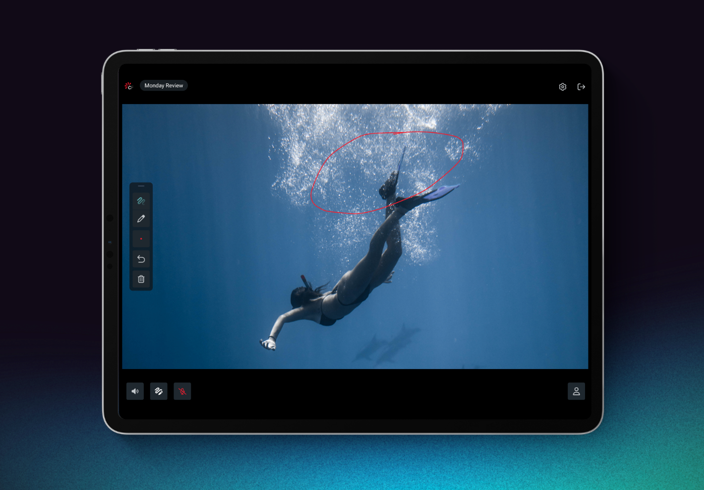
iPad: Deeper review, with precision annotation
On iPad, Flex is designed for fuller participation, including a more “sit down and review” experience.
Users can join both Classic and Editorial Sessions with rich interaction, including:
- Full video and audio participation
- Deep engagement with session tools
- Enhanced annotation with Apple Pencil for precision input
The assumption is simple: if you’re joining from an iPad, you’re more likely to be actively reviewing and you need the tools to match.
“We think of iPad as a serious work device,” says Brandon Bussinger, VP Product Management. “If someone’s joining a session from iPad, Flex should let them participate fully.”
iPad Editorial Sessions: Stay in the flow
Editorial Sessions on iPad are designed to support real collaboration without locking users into one way of working. The interface adapts to what you’re focused on - people, content, or both - while keeping review actions close at hand.
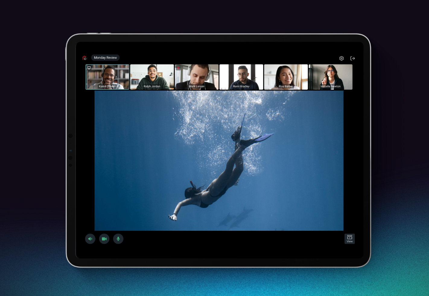
Viewing Modes
iPad Editorial Sessions support three viewing modes:
- Participant Mode
- Content Mode
- Participant + Content Mode
Moving Between Modes
Users can switch modes directly, use pinch/expand gestures, or let Flex adapt automatically based on what’s happening in the session, reducing friction and decision-making, especially for more passive participants.
Confidence in setup = confidence in feedback
Audio and video controls are grouped in the footer for quick access, while a central device settings panel gives users control over:
- Microphone, camera, and speaker selection
- Mic input levels and speaker tests
- Hide self-view
- HDR display colour space
“A lot of this comes down to confidence,” says Bussinger. “When users trust their setup, they can focus on the conversation instead of the controls.”
Built for real-world review
Flex Mobile isn’t about doing everything everywhere. It’s about recognising that how people join a session changes what they need and ensuring they can still contribute meaningful feedback.
By designing separately for iPad and iPhone, Flex Mobile supports quick annotation and lightweight input when you’re on the move, and deeper, more precise review when you’re properly dialled in.
Either way, the goal is the same: keep review moving, and keep everyone included.
New to ClearView Flex?
If you'd like to see how this works in practice, our team would be happy to walk you through it. Book a demo →

Get the latest news and updates from Sohonet in your inbox
More from the blog
View all.png)